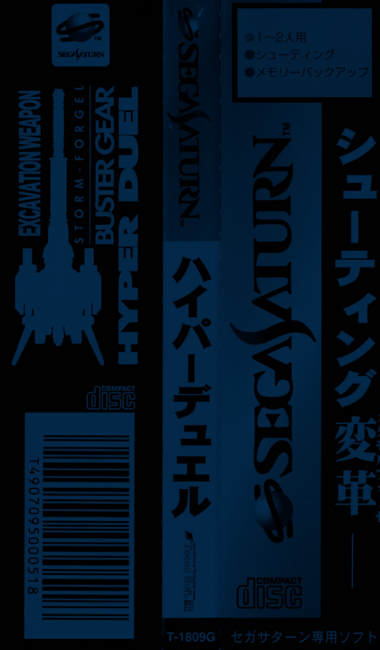
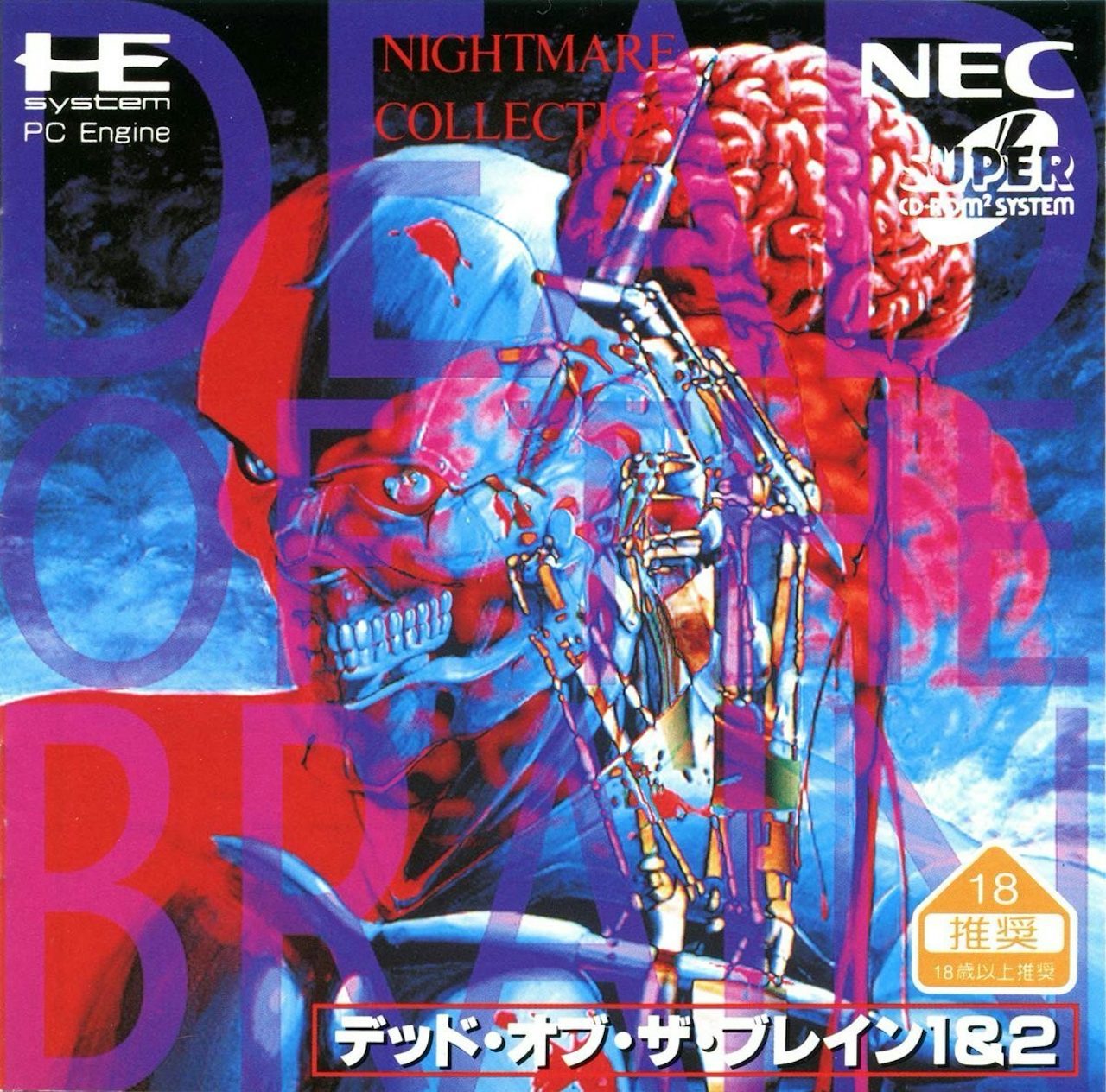
I am obsessed with something new in the world of design. Well, actually, something quite old. Specifically, late 90s and early 2000s Japanese video game art. And also, video game ads. And also, photos of old video game hardware. I am knee-deep in gaming nostalgia.
A lot of the art I’ve become fascinated with is a particular aesthetic born around the fourth generation of video gaming (spanning from the 16-bit boom of the PC Engine / TurboGrafx-16 and Sega Genesis, through to the original PlayStation, Sega Saturn, and the Dreamcast). One which blends hand-drawn art and lettering, dramatic typography, highly technical layouts, and colorful, sometimes cartoonish patterns.
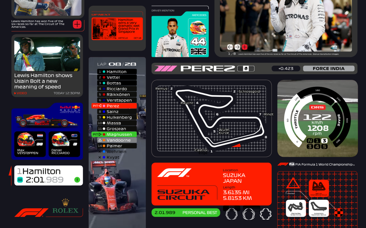
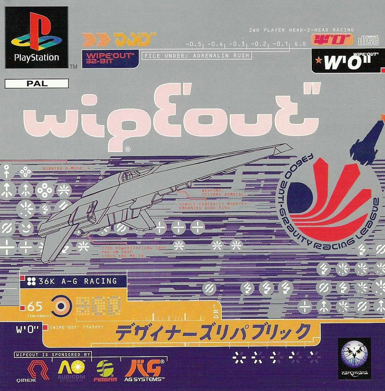
Design, like fashion, moves in cycles, and we’re starting to see a new wave of Japanese game art in pop design. You can see it in the Richard Turley-led Wieden + Kennedy rebranding of the Formula One logo / design language (heavy, heavy shades of Wipeout) or in the varied styles of Australian artist Jonathan Zawada.
Swipe on mobile or scroll on desktop to explore the designs.
Cory Schmitz — a designer who’s worked on projects like the Oculus Rift rebranding and logo design for the game Shadow of the Colossus — has been assembling many of the best examples of the original era on his Tumblr, QuickQuick. I reached out to him to ask about what he was drawn to in this particular style: “As a designer this stuff is super inspirational because it’s so different from current design trends. A lot of unexpected colors, type, and compositions. And I really like the weird sense of nostalgia I get from stuff I haven’t necessarily seen before.” It’s Cory’s curation you’ll see a lot of in the card stack here.
As we move away from the Web 2.0 / Apple mandate of clean, orderly, sterile design, into a more playful, experimental, artistic phase (hello Dropbox redesign), this particular style of art feels like an obvious meeting point born out of a desire for orderly information delivery and a more primal need for some degree of controlled chaos. Mostly, though, it just looks really fucking cool.
Swipe on mobile or scroll on desktop to explore the designs.


